
Lolo Oxygen/Pipa Child
Lolo/Pipa
L/P
©2026

Lolo Oxygen / Pipa Child
Typeface: OT Neue Montreal
Nothing Phone ( 4b ) Launch
Strategy + Design
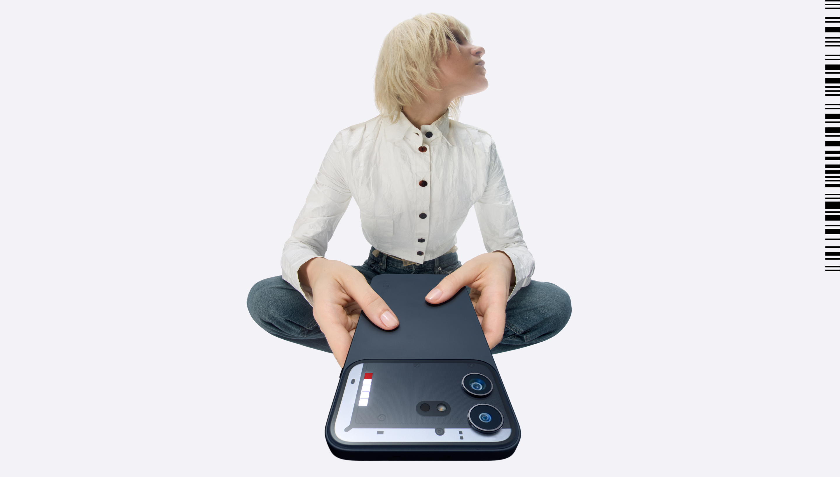
Well, This was our first collaboration with Nothing. We worked with team from scratch to discover the direction for the campaign. Quick context: Nothing launched it’s first ever “b” series with Phone (4b) as an entry point into everything Nothing. Its design, unibody and four new colours stand out from the rest – like you do. We worked with the team to shape the creative direction, help bring the design to life, and set the ground rules across different verticals. As Nothing’s first product designed and built specifically for India, the challenge was to consider the audience’s pain points while staying true to what makes Nothing, Nothing.

Approach
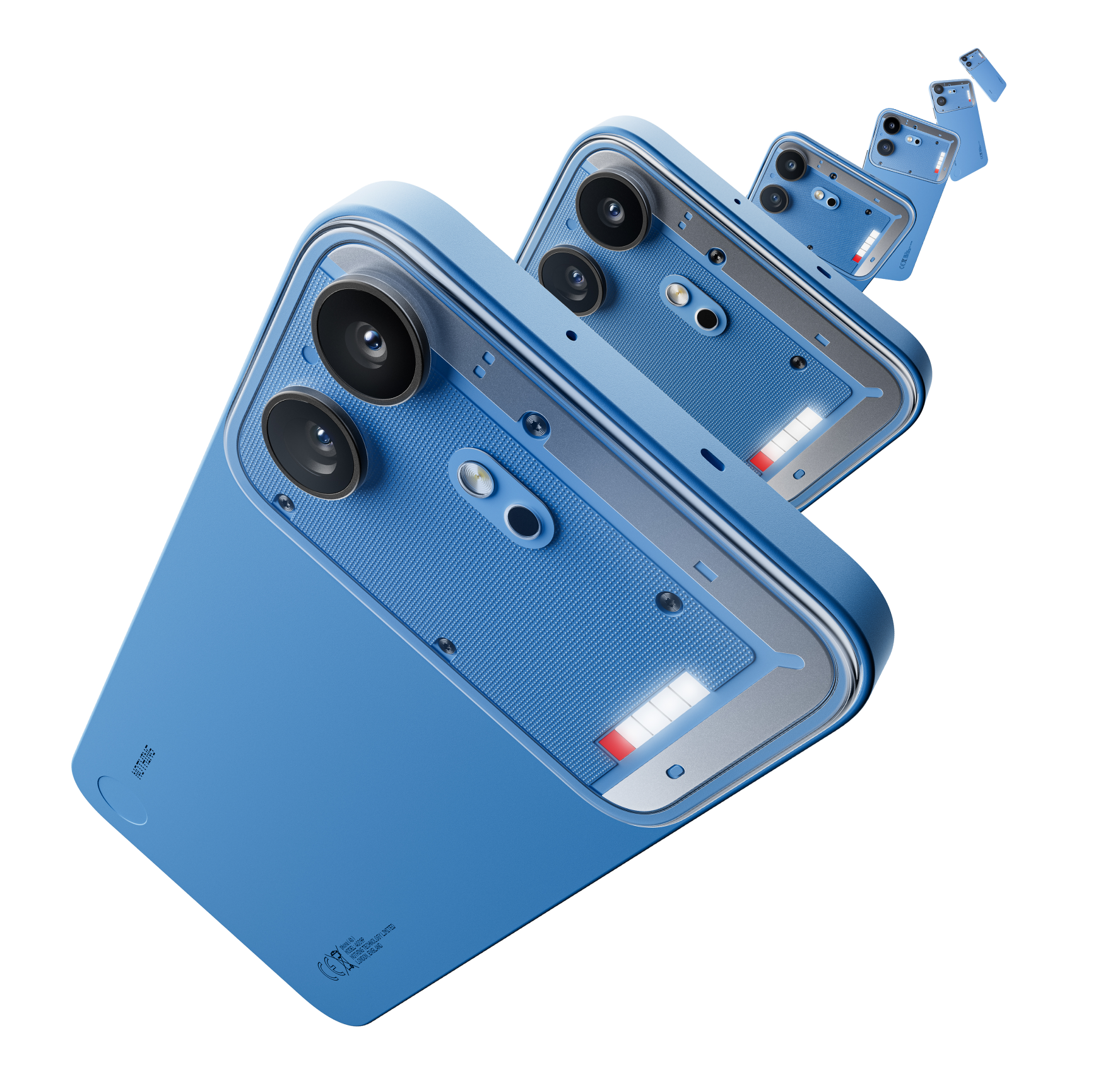
Framed as the aspirational entry to Nothing’s ecosystem –complete with everything you need from a phone. Focus on functions over niche lifestyle references, showing Phone (4b) can handle everyday needs like calls, photos, schedules, Glyph Bar.
Tone is confident, self-aware and reactive. We’re smart, but we don’t need to prove it.
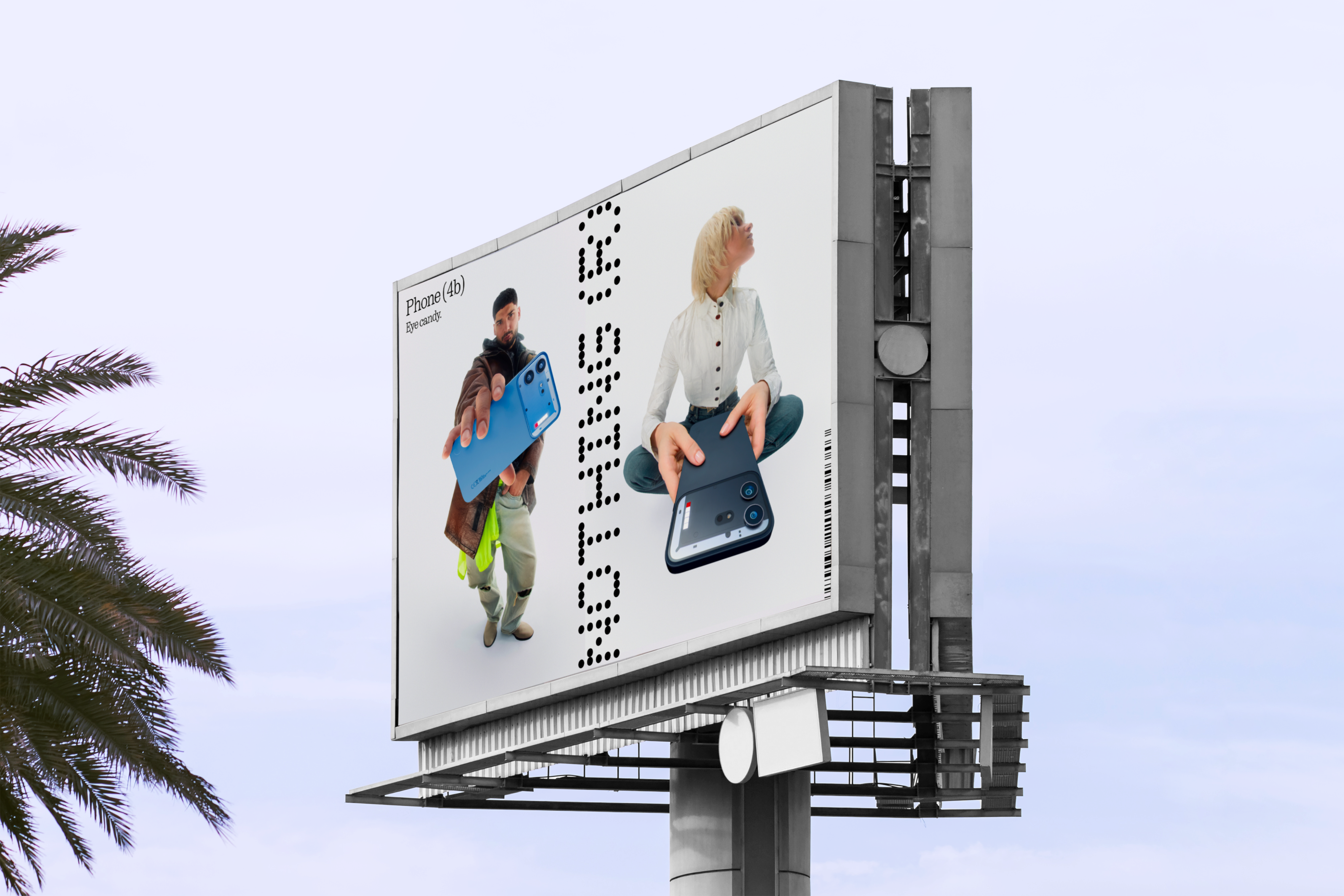
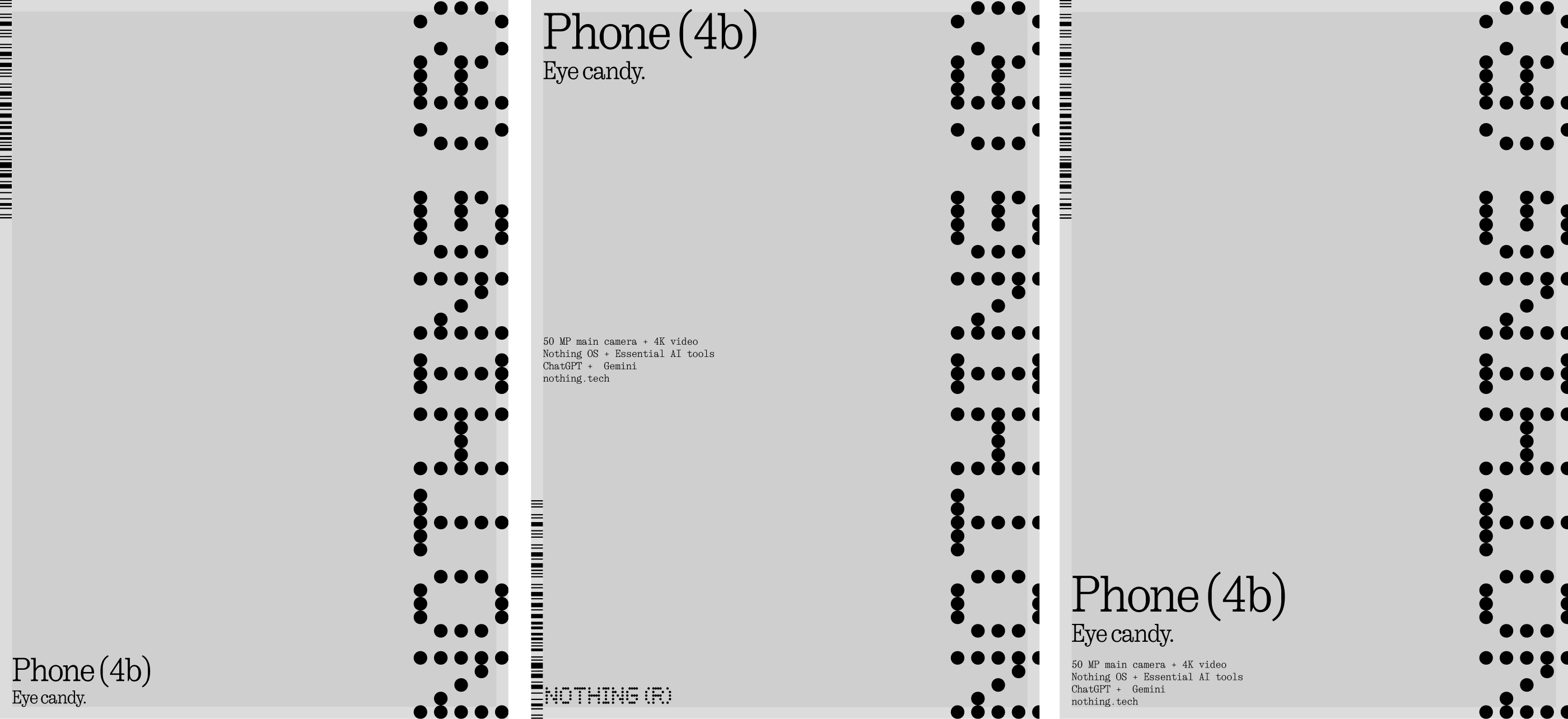
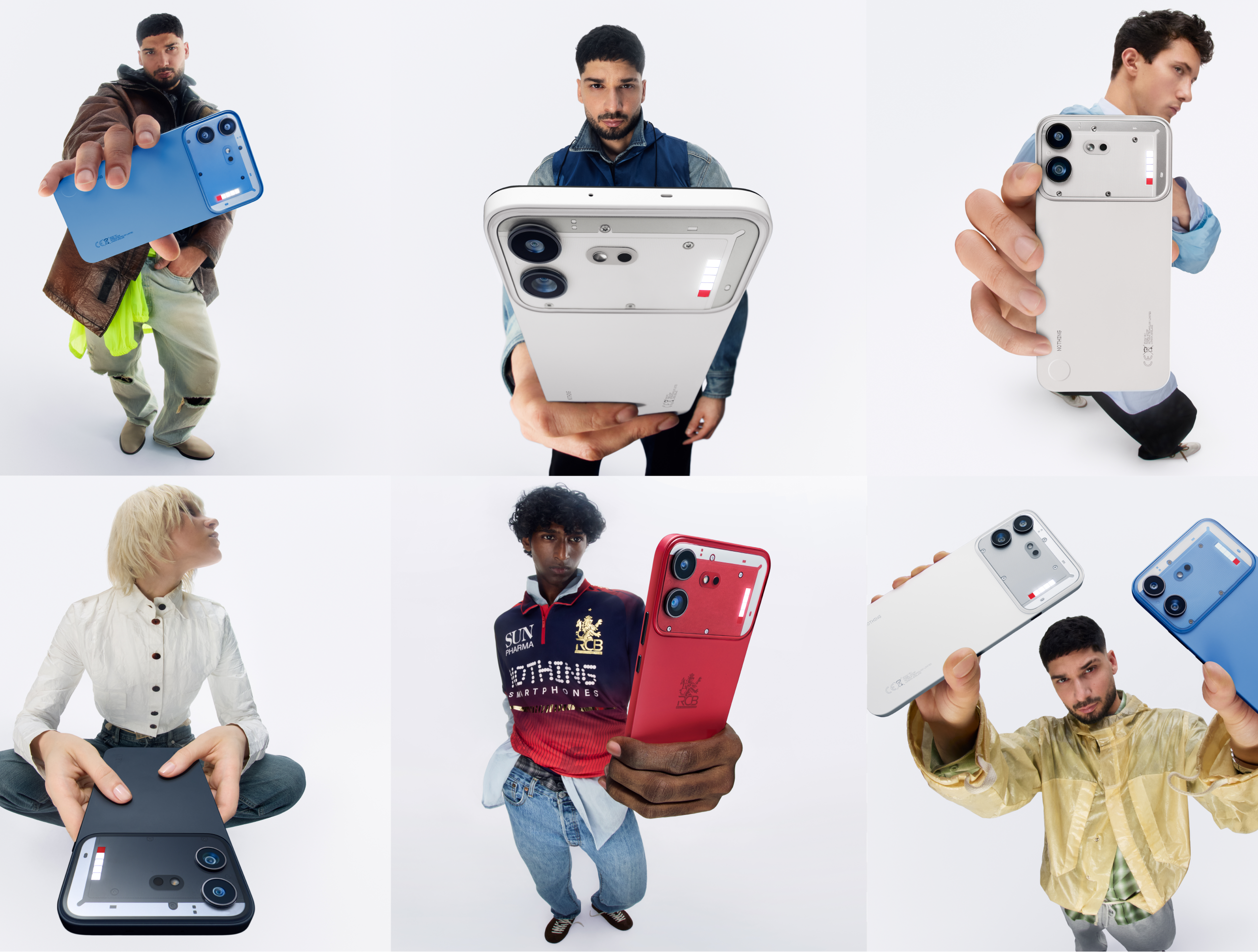
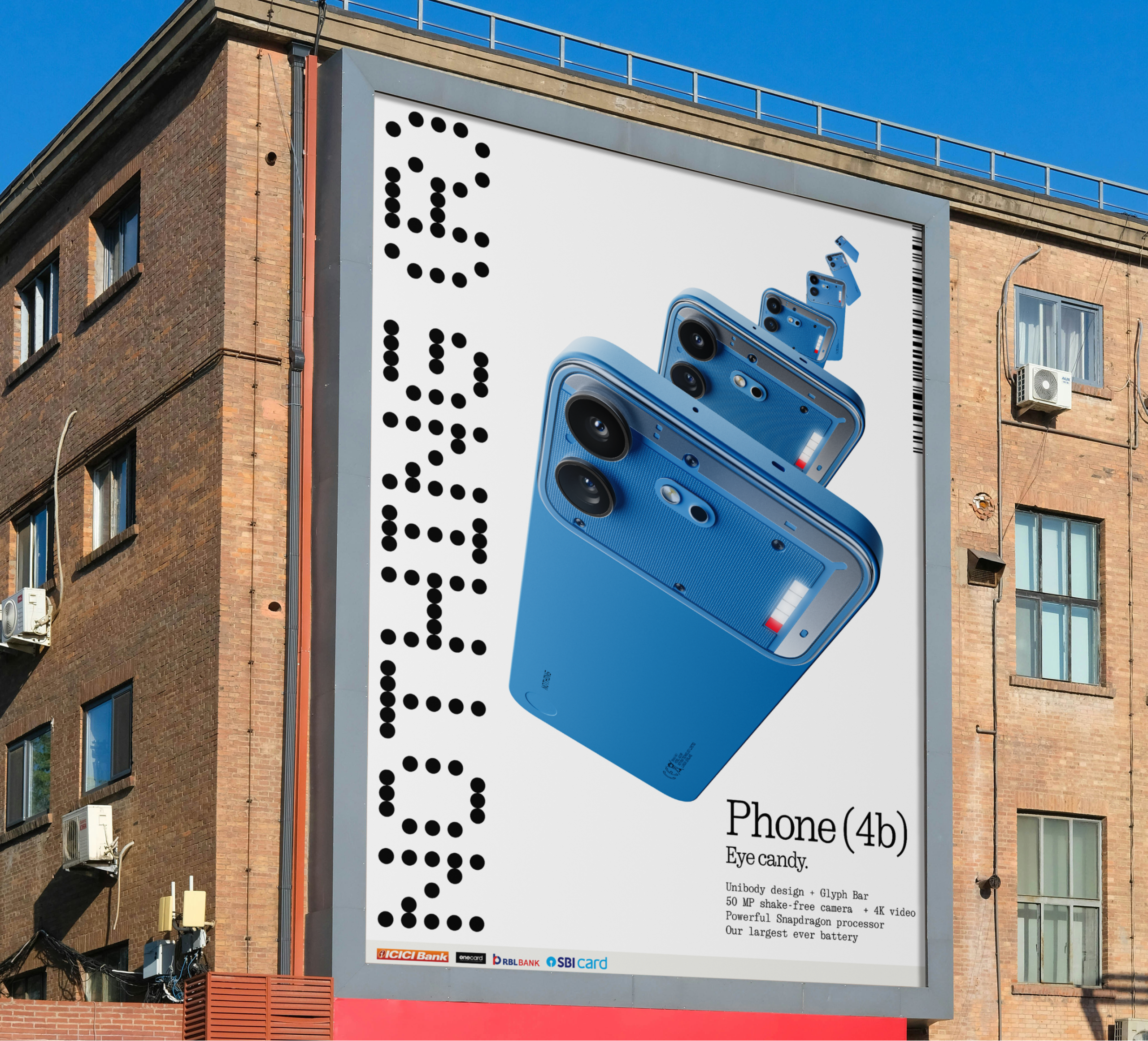
We expand the campaign from digital to retail stores to OOH. We ran the outdoor campaign to top tier metro cities spreading the product launch. For the key visual we had used phone render and K$NA for Indian market. Oh yes, We also collaborated with K$NA to build mass presence and social credibility for the brand and product with India-centric talent. He is also high-value cultural bridge to tap into India's massive hip-hop community.
Credits
Brand Strategiest
Ruby Wight
Harsh
Aditya
Ayush Tandon, Ryan Latham.
Creative Director
Ryan LathamDesign
Lolo Oxygen
Pipa Child
Creative Production House
Tiagi productionsLolo Oxygen/Pipa Child
Lolo/Pipa
L/P
©2026

Lolo Oxygen / Pipa Child
Typeface from the courtesy of OT TYPE FOUNDRY — OT Neue Montreal
Nothing Phone ( 4b ) Launch
Strategy + Design
Well, This was our first collaboration with Nothing. We worked with team from scratch to discover the direction for the campaign. Quick context: Nothing launched it’s first ever “b” series with Phone (4b) as an entry point into everything Nothing. Its design, unibody and four new colours stand out from the rest – like you do. We worked with the team to shape the creative direction, help bring the design to life, and set the ground rules across different verticals. As Nothing’s first product designed and built specifically for India, the challenge was to consider the audience’s pain points while staying true to what makes Nothing, Nothing.
Phone (4b)Eye Candy.

Approach
Framed as the aspirational entry to Nothing’s ecosystem –complete with everything you need from a phone. Focus on functions over niche lifestyle references, showing Phone (4b) can handle everyday needs like calls, photos, schedules, Glyph Bar.
Tone is confident, self-aware and reactive. We’re smart, but we don’t need to prove it.
We expand the campaign from digital to retail stores to OOH. We ran the outdoor campaign to top tier metro cities spreading the product launch. For the key visual we had used phone render and K$NA for Indian market. Oh yes, We also collaborated with K$NA to build mass presence and social credibility for the brand and product with India-centric talent. He is also high-value cultural bridge to tap into India's massive hip-hop community.
Credits
Brand Strategiest
Ruby WightCreative Director
Ryan LathamDesign
Lolo Oxygen
Pipa Child
Creative Production House
Tiagi productionsLolo Oxygen/Pipa Child
Lolo/Pipa
L/P
©2026
Lolo Oxygen / Pipa Child
Typeface from the courtesy of OT TYPE FOUNDRY — OT Neue Montreal